Blackstone
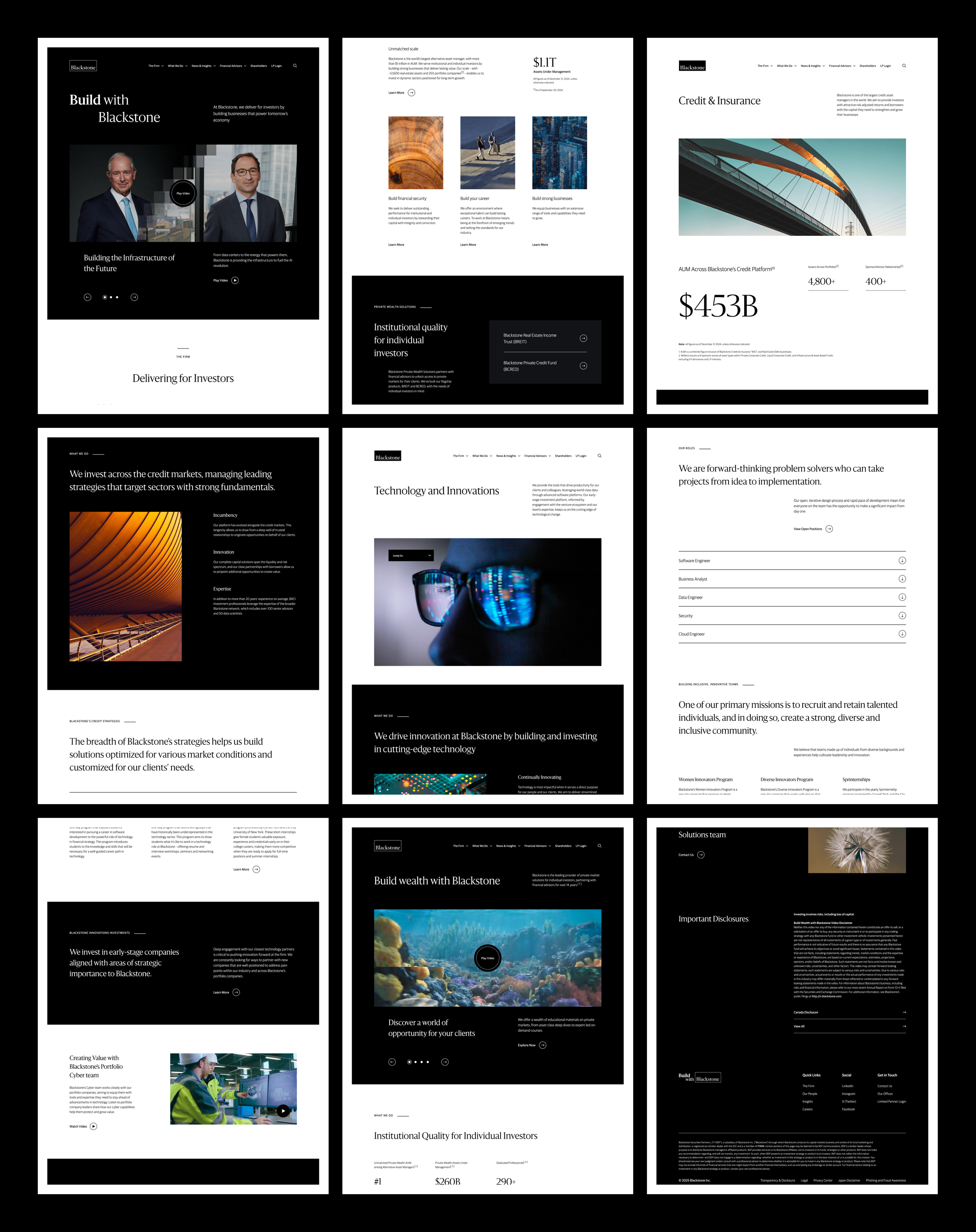
Developed a design system for a financial services platform, ensuring a consistent brand experience. Portfolio View
5 minute read
Blackstone is a leading global investment firm with a diversified asset management business.
They represent an investment opportunity with strong growth potential and experienced management suitable for investors looking to enhance their portfolio’s stability and performance.
THE CHALLENGE
Modernizing an industry leader.
Blackstone is widely recognized as one of the largest and most influential alternative investment firms globally. Its leadership in private equity, real estate, credit, and hedge funds underscores its expertise and success in managing diverse assets.
Although they have been dominant in global financial markets, their online presence was outdated and inconsistent. This presented an opportunity to orchestrate a comprehensive overhaul of the Blackstone brand and design system.
blackstone.com before the redesign.
THE SOLUTION
Learn from the best of the field.
Our task was to rebuild the Blackstone brand from the ground up, while staying true to their acquired reputation as global financial leaders. We created a design system rooted in research and usability, drawing insights from industry leaders and innovators to build upon proven frameworks.
This allows our cross-functional design, development, and product teams to communicate design build and frameworks with accuracy and efficiency facilitating buy-in from Blackstone leadership.
“We created the Design & Development Language (DDL), an all-inclusive system for translating design to engineers resulting in consistent, pixel-perfect outcomes across desktop, tablet, and mobile interfaces.”
THE LEGACY
Core principles create lasting success.
Pre DDL, most brand and design work was contracted to external agencies. This resulted in inconsistent outcomes and quality standards.
They decided to create a dedicated internal design department to resolve these issues, and I was one of the foundational UX hires.
This presented me the opportunity to establish design practices and ways of working cross-functionally with my team, which has been instrumental to our success and output as a department.

SETTING THE STAGE
The browser’s inspect tool was used to review and validate the live HTML and CSS, ensuring clean structure, proper semantic tagging, consistent naming, accurate spacing, and adherence to the grid.
We began with a survey of the current website to identify inconsistencies in design, layout, and type.
The 8-point grid system was implemented to establish visual consistency, streamline development, and improve the user experience of blackstone.com.
This framework uses increments of 8 pixels to define the spacing, margins, padding, and dimensions of elements facilitating a more efficient workflow for designers and developers.
STICKING TO THE SCRIPT
Sanomat and Guardian Sans convey trust, professionalism, and clarity while enhancing readability, ensuring accessibility, and reinforcing the site's brand identity.
Selecting appropriate fonts is crucial to conveying trust, professionalism, and clarity. Our goal was to improve readability, ensure accessibility, and strengthen the site's brand identity.
Sanomat and Guardian Sans stood out for their clean lines, professional look, and seamless paring.
They were tested in various contexts, including headlines, body text, and navigational elements. Page mockups and prototypes were created to assess performance in real-world scenarios.
We revised font sizes, line heights and text spacing to conform to the 8-point grid, ensuring text elements aligned perfectly with design components.
FINDING YOUR AUDIENCE
The Header (above) is a flexible, adaptable element that can be applied to any component, offering multiple variations to suit different content needs.
The Accordion (below) streamlines content organization with an RTE and support for embedded UI elements, enhancing readability and flexibility.
Requirements gathering from stakeholders was essential to ensure the new design system would meet business goals and user needs.
We held workshops with the marketing teams to understand their goals, such as improving brand visibility and enhancing content strategy.
Meetings with the Legal & Compliance (L&C) teams focused on ensuring the website complies with regulatory requirements.
We gathered insights from product owners about their specific needs and challenges.
SIZING THE MARKET
The Quote Carousel (above) displays rotating quotes with optional images, titles, and featured entities for seamless browsing.
The In-Line Disclaimer (below) seamlessly integrates legal disclosures into any component, ensuring compliance without disrupting the user experience.
All existing content was surveyed to assess its relevance, accuracy, and performance. This included analyzing page views, user engagement, and SEO performance.
Usability tests were conducted to identify pain points in areas including site navigation, page load, and accessibility for screen readers.
Competitive analysis was done to identify best practices and areas where competitors excel. This included examining their design system, platform features, content strategy, and user engagement tactics.
We researched current trends in web design and UX within the finance industry and beyond. This included studying emerging technologies, user behavior patterns, and design innovations.
PASSING THE BATON
The Scrolling Logo List showcases logos of portfolio companies with automatic scrolling and play/pause functionality. On hover, the logo’s color animates, and on click, an overlay reveals additional details and an optional link. There are optional tabs / dropdown list to filter logos.
To ensure a smooth transition from design to launch, we implemented an agile review and hand-off process, followed by user testing.
We created detailed presentations of the redesigned components, their requirements, page examples, and user stories for marketing teams, product owners, L&C, and developers.
All feedback was documented and prioritized based on their impact and feasibility. We then iterated on design, making necessary adjustments and enhancements.
User Acceptance Testing (UAT) focused on real-world usage and gathered feedback on the overall user experience, ensuring the design system met business and user expectations.

