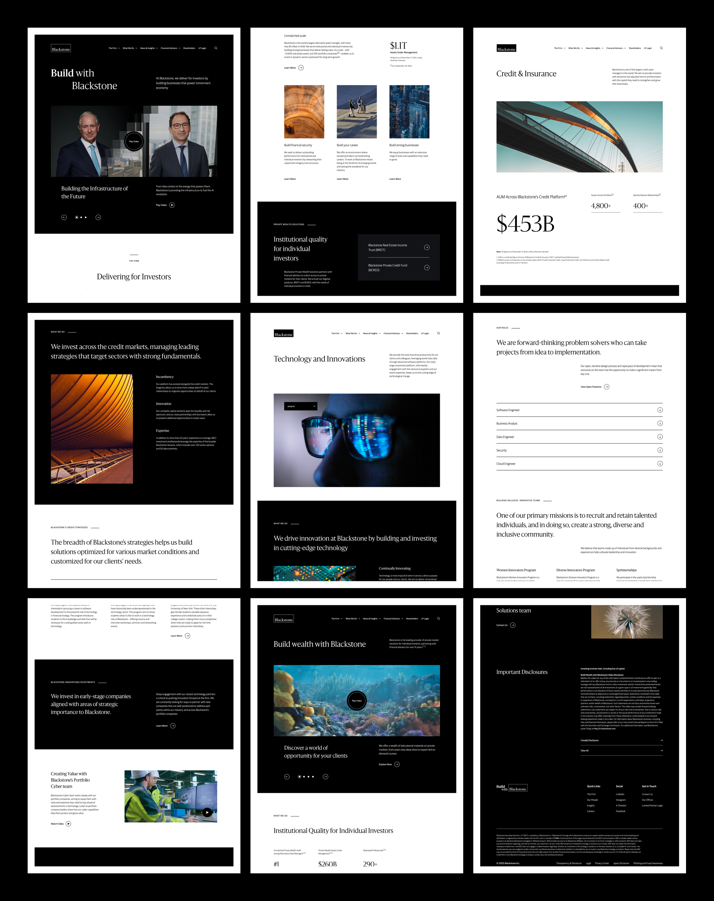
Blackstone
Developed a design system for a financial services platform, ensuring a consistent brand experience.
Brand Cohesion, Scalable UX, and System Thinking
-
Senior UX Designer, collaborating with product, engineering, and stakeholders to deliver polished, production-ready UI designs.
UX strategy, design systems, prototyping, interaction design, visual frameworks, testing, QA. -
I aimed to create a scalable, WCAG AA-compliant design system that enhanced brand cohesion and user engagement. By developing 60+ UI components and defining typography, iconography, color, and motion frameworks, I ensured visual consistency across touchpoints.
My work on adaptable templates, interactive prototypes, and UX strategy streamlined design implementation, improved usability, and aligned digital experiences with business and brand objectives.
-
My PM partner Will made collaboration seamless — his clear communication, organization, and strategic mindset kept everything on track. Working with him made designing, iterating, and aligning on UX strategy both efficient and rewarding.
PROBLEM
Blackstone’s online presence did not reflect its leadership and expertise in global financial markets, with outdated and inconsistent design across digital touchpoints.
blackstone.com before the redesign.
OPPORTUNITY
This created an opportunity to develop a cohesive design system that strengthened brand identity and enhanced user experience.

“We created the Design & Development Language, an all-inclusive system for translating design to engineers resulting in consistent, pixel-perfect outcomes across desktop, tablet, and mobile interfaces.”
The Scrolling Logo List showcases logos of portfolio companies with automatic scrolling and play/pause functionality. On hover, the logo’s color animates, and on click, an overlay reveals additional details and an optional link. There are optional tabs / dropdown list to filter logos.
The Quote Carousel (above) displays rotating quotes with optional images, titles, and featured entities for seamless browsing.
The In-Line Disclaimer (below) seamlessly integrates legal disclosures into any component, ensuring compliance without disrupting the user experience.
The Header (above) is a flexible, adaptable element that can be applied to any component, offering multiple variations to suit different content needs.
The Accordion (below) streamlines content organization with an RTE and support for embedded UI elements, enhancing readability and flexibility.