SSENSE MOBILE
Proposed a mobile app redesign concept to elevate the luxury eCommerce experience, focusing on intuitive navigation and seamless shopping journeys.
5 minute read
Role | Product Designer (Design Exercise)
Focus | Mobile Engagement and Conversion
Highlight | The mobile redesign improved product discovery, navigation, and engagement creating a more seamless and immersive experience
IMPACT
Enhanced Mobile Engagement with Simplified User Flows and Scalable Design Framework.
Projected a 15% increase in mobile engagement by simplifying user flows and improving accessibility to core shopping features
Designed a streamlined checkout process, reducing cognitive load and supporting a 10-15% potential boost in conversion rates
Delivered a scalable, responsive mobile design framework, adaptable for future feature enhancements and usability updates

SSENSE is one of the world’s premier online shopping destinations.
They carry the world’s best brands, provide exceptional product images, and create charming editorial content for its customer base.
THE CHALLENGE
Less is always more.
The SSENSE mobile app has a lot to offer, however too much choice can be overwhelming for users.
THE SOLUTION
Focus on the essentials.
With the feedback received from research and user-testing, I’ve provided a solution that streamlines the login cadence, checkout flow and product discovery process, while granting users access to its rich editorial content.
This case study will walk you through the changes implemented to improve the user experience of the SSENSE mobile app.
UI TWEAKS
Subtle updates for modern inspiration.
Dark mode is utilized as lead UI interface for better contrast when viewing images and reading text.
Text boxes have been replaced with border lines for clearer segmentation and a cleaner interface.
BEFORE
“Create account” was substituted for register as the former is more familiar for casual users.
The “login” and “create account” prompts have been moved to the bottom of the screen making them more accessible to users.
AFTER
Once the app is opened you are prompted by the login screen.
This is a trend seen in popular social media platforms such as Instagram, Pinterest, and Twitter to capture users.
This action can be cancelled however for casual browsers.
BEFORE
The product landing page has been replaced with a content page directing users to view new arrivals, editorial content, and the newsletter.
This expands the scope of the app creating a more immersive experience for users.
This allows brands to better curate and showcase their brand story to consumers in addition to selling product.
AFTER
Primary navigation buttons were moved to the bottom of the screen for easier user access.
BEFORE
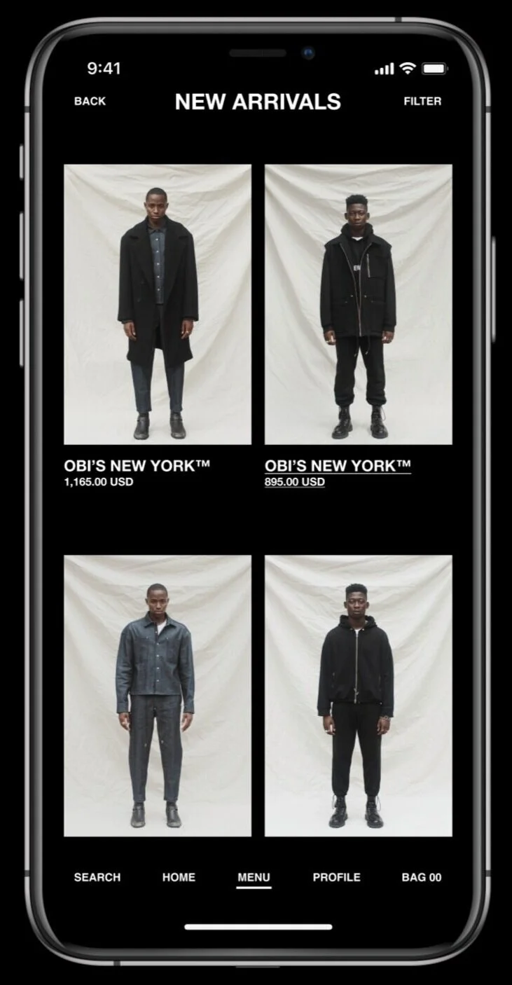
New Arrivals has been replaced with images instead of leading with text.
Many users may not be aware of the brands being highlighted and the images translate across potential language barriers.
BEFORE
The hovering action buttons were removed from the product shopping page to improve viewability while browsing.
AFTER
Two column image scrolling was used in favor of three for larger imagery and text, and a less cluttered viewing experience.
BEFORE
A horizontal sliding scroll is utilized as opposed to a vertical scroll.
The following image is displayed on the right-hand side of the viewing area informing users of the awaiting content.
AFTER
BEFORE
The various item lists have been condensed to “similar items” to reduce clutter and simplify the discovery process.
AFTER
BEFORE
Size selection has been made a focal point and moved to the center. The font has been increased for improved useability.
The size guide is aligned at the center for a seamless flow.
AFTER
BEFORE
The pricing has been moved below the product allowing for larger imagery and product info.
Redundant headlines have been removed for a more focused and streamlined user flow.
AFTER
BEFORE
Navigation titles were added at the top of screen for better recall of the page being viewed.
AFTER
The “bag” icon (bottom-right) becomes yellow when populated so it remains a focal point as the user shops and browses the platform.
Once tapped, it brings you to the shopping bag.
KEY TAKEAWAYS
Making the best even better.
Reimagining the site navigation to allow more room for content and easier access to products
Utilizing a two column layout to provide a more streamlined product flow
Condensing products and media to reduce cognitive load and inspire further exploration of the platform
WANT MORE?
Take a closer look at the research and analysis for this case study here.


